design system for ott platform
Crafting a scalable Design System for multi-platform use

To create an efficient design system that is simple, easy to use and scalable, while bridging the gap between designers and developers.
About
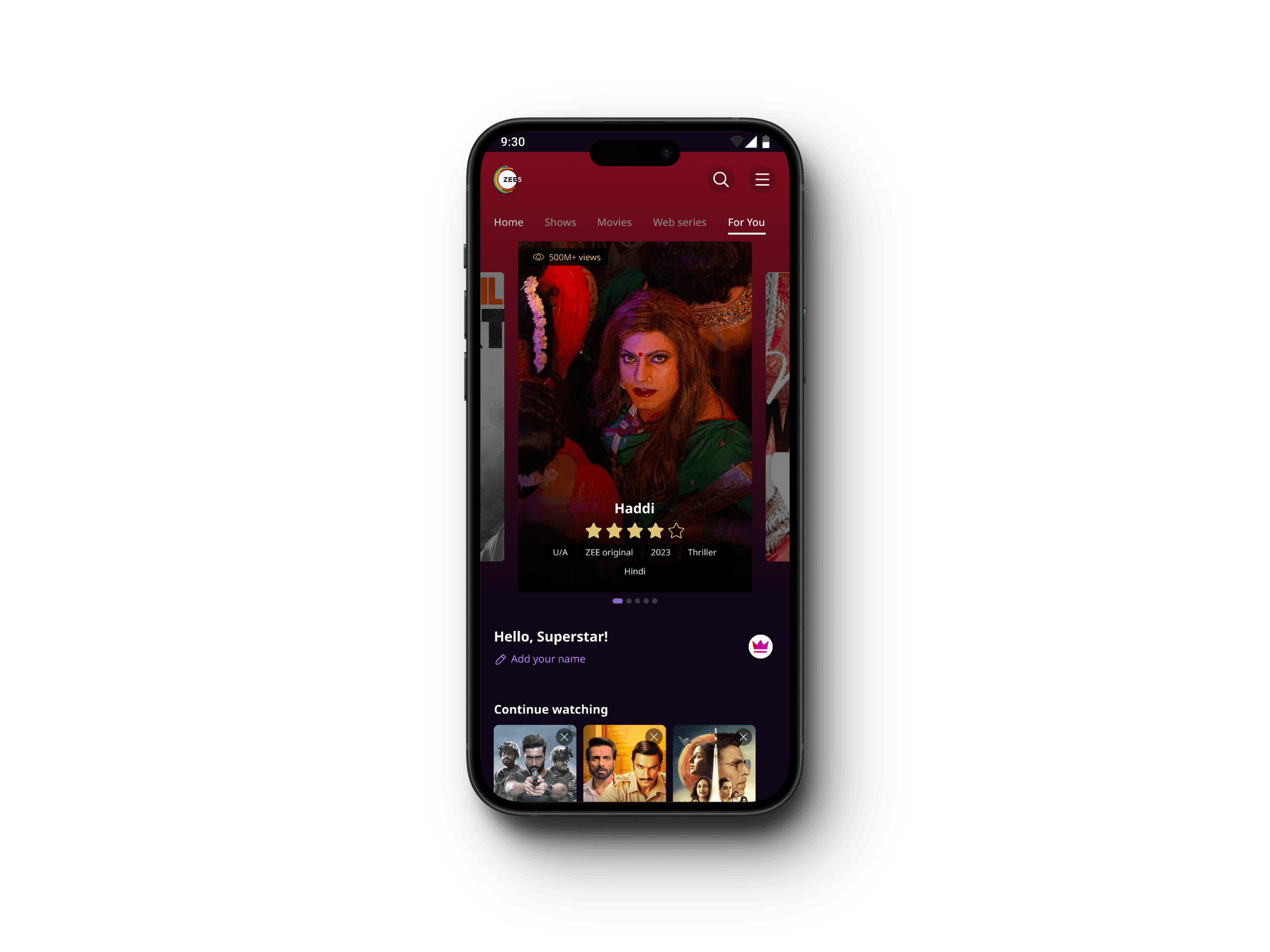
ZEE5 is a top Indian OTT platform delivering diverse entertainment content, including movies, TV shows, and originals, accessible on mobile, web, and connected TV.
Background
Prior to the design system, Zee5's UI lacked consistency. Designing for different platforms like web, mobile, and smart TVs involved duplicating efforts and inconsistencies in visual appearance and user experience. This created difficulties for both designers and developers.
Roles & Responsibilities
• Was advocate for the Design system within design team and cross function.
• Streamlined process of adapting to new Design system from old
• Created advanced components, tokens, and other essential elements for mobile, web, and CTV platforms.
• Streamlined the design developer handover process.
• Conducted workshops to streamline the design process across the team.
Goals
• Maintaining the consistency and brand language same across different devices and platforms
• Our goal was to minimize development effort by identifying reusable components. Changes made in one place should automatically update throughout the app, ensuring consistency and efficiency.
• We sought to streamline the process and enhance collaboration among designers without causing delays. Our objective was to provide a consistent user experience and ensure designers receive timely updates on changes or additions to the design system.
This category details the step-by-step approach taken during the project, including research, planning, design, development, testing, and optimization phases.
Collaboration
As a product designer, I facilitated seamless collaboration by connecting with visual designers, UX writers, motion designers, UX researchers, product managers, developers, and other product designers.
Research & Planning
We began by studying various public design systems to guide our initial structure, recognizing the need to tailor it to ZEE's unique requirements. Through key sources, user studies, and requirement analysis, we deepened our understanding of design systems, tokens, components, and relevant software.
Analyse
We analysed the existing design system and OTT platform requirements, Design Development process and issues to refine our approach to tailor the design system for ZEE's needs.
Define
We collaborated closely with developers to define fully tokenized system, ensuring every screen of the application could be deconstructed into tokens. Maintaining constant communication with both designers and developers, we incorporated diverse perspectives to craft the optimal solution.
Testing & Optimization
Conducted rigorous testing across various devices and platforms to ensure compatibility and performance. Gathered user feedback through beta testing and iteratively optimized the app based on usability metrics and user satisfaction.
We needed our platform to work well on mobile, web, and TV, so scalability was crucial for our big design team. We organized our design elements using simple principles, making it easy to adjust for different needs. Figma's features helped us adapt smoothly, while we also expanded our system to cover motion, writing, and illustrations, making sure every aspect was covered.


Design visualization
Our system enabled designers to see how their designs would look across different platforms, even if they were initially created for just one screen.
Responsive Design
Leveraging Figma variables, we ensured that our designs could adapt seamlessly to various devices, including mobile phones, tablets, and desktops.
Maintenance and adaptability
Through cross-team collaboration facilitated by Tokens Studio, we ensured continuous maintenance and easy adaptation of our design system.
Documentation
We provided comprehensive documentation to guide designers and developers in using the design system effectively.
Ease of use
Our system was designed with simplicity in mind, ensuring a smooth experience for both designers and developers alike.
Icons
Checkbox
Label
Label
Label
Label
Label
Label
Radio button
Label
Label
Label
Label
Label
Label
Toggle
Input
+91
Input 10-digit number
Helper text
+91
93485 23840
Helper text
+91
93485 23840
Helper text
+91
93485 23840
Helper text
+91
93485 23840
Helper text
+91
93485 23840
Singapore (+91)
Singapore (+91)
Singapore (+91)
Singapore (+91)
Snackbar
Text goes here
Action
Text goes here
Action
Text goes here
Action
Text goes here
Action
Colors
Navigation
BUY PLAN
Title
BUY PLAN
Center Title
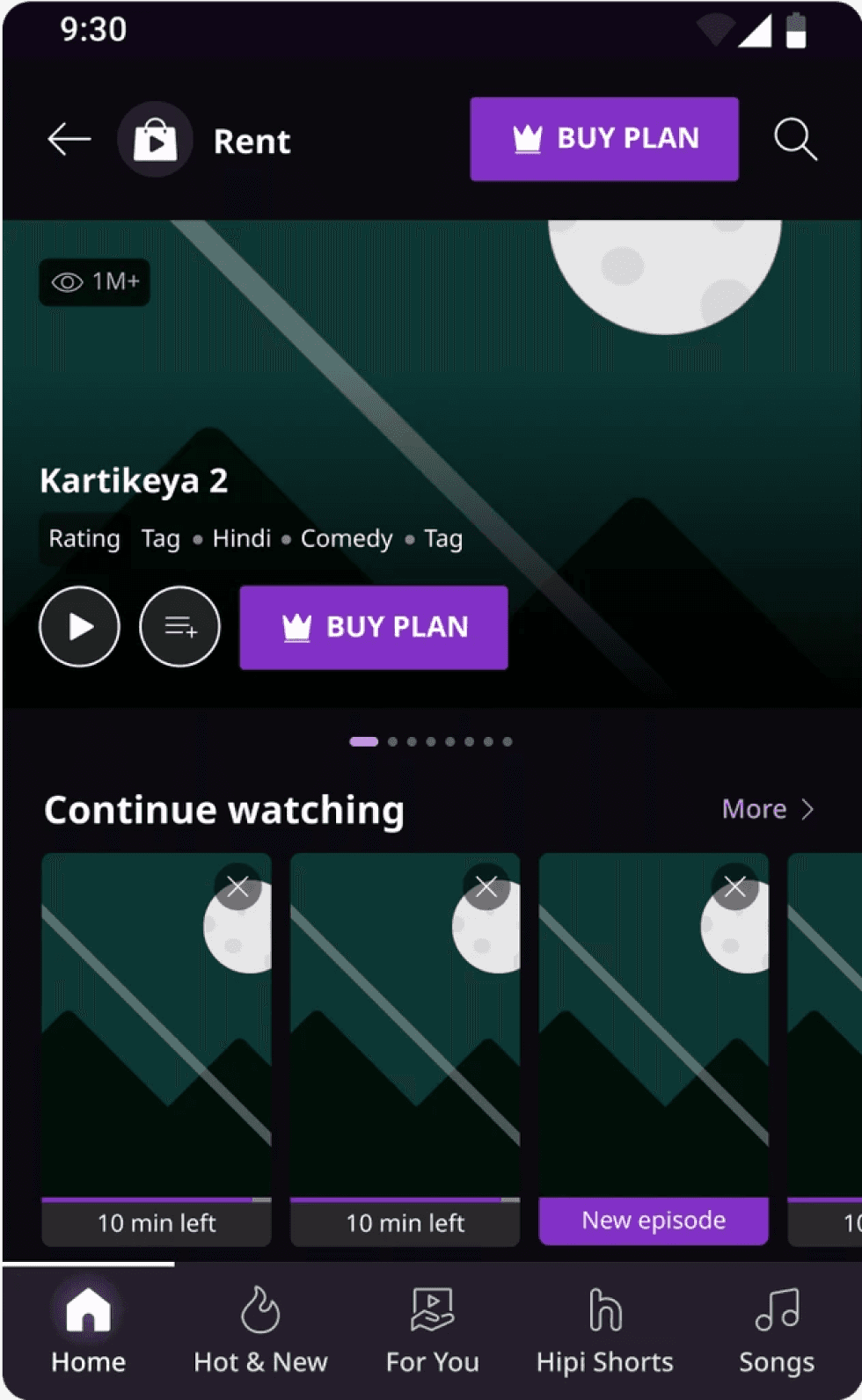
Banner Carousel

1M+
Kung Fu Panda 4
Rating
Tag
Tag
Tag
Tag
BUY PLAN


Motion
Custom bezier value
0.55, 0, 0.45, 1
Illustrations
UX Writing guidelines
Write in sentence case
We write in sentence case. In sentence case, we capitalise only the first letter of a sentence.
We also capitalise proper nouns.
Copy written in sentence case is easier to read compared to other types of cases:
This is sentence case
This Title Case
this lower case
Examples :
Log in
Log In
Example on a button
Watch 'Kisi Ki Bhai Kisi Ki Jaan' on ZEE5
Watch 'Kisi ki bhai kisi ki jaan' on ZEE5
Example when using proper nouns
Use British English
We write in British English.
Examples :
Writing about one-time passwords (OTPs)
Verification of mobile numbers or an account happens with the help of an OTP. The OTP is not the item that needs to be verified.
Examples :
Verify with OTP
Verify OTP
Example on a primary CTA
Verifying...
Verifying OTP...
Example of a CTA in disabled state
Write in 3 words or less
Try to write CTA copy for primary and secondary buttons in 3 words or less. Remove prepositions or articles where you can.
Examples :
Verify with SMS
Verify with outbound SMS
Haven't received OTP?
Haven't received the OTP yet?
Get now
Get it now
Using verbs
Try to start CTAs with the more important and relevant verb where possible.
Examples :
Using Login and Log in
Log in is 2 words. But when you're referring to the page or process it becomes 1 word i.e. Login page or Login process.
Examples :
Example on system
setting headline
Example on a bottomsheet
where user needs to fill in details
Some word/phrase choices
Opt for these words when writing flows for uniformity
Word combinations that cannot be used together
These words cannot be used together in a sentence or in conjunction with each other in CTAs.
Examples :
Retry with OTP
Retry with OTP again
Remove device
Not now
Remove device
Cancel
Delete
Not now
Delete
Cancel
Writing about ZEE5 plans
Use the word 'plan' for users who haven't bought a subscription
Use the name of the plan if the user has already subscribed to us
Use the word 'subscriber' when referring to the user. Not member.
Refer to plans as plans. Not packs.
These options can be used to write similar copy
Leverage design to shorten CTA copy
Pair copy with intuitive design so that you can reduce the amount of text you write on the button.
For examples click here.
Speak in first person in CTAs
Use a first-person narrative. This gives the user ownership of their actions.
For examples click here.
Keeping things uniform in a flow
Using similar words can reduce cognitive load on the user
End a multi-information flow with Done
End a single-information flow with OK
For examples click here.
Choose simple words
Options for CTAs are more often than not synonymous. Choose the simplest option.
For examples click here.
Here, the outcomes of the project are highlighted.
Increased Efficiency
Enhanced the design and development process efficiency by over 40%, speeding up project timelines.
Implementation
Updated the onboarding task flow with the new design system, achieving full adoption in less than 4 days for both design and development stages.
Design & Dev Compatibility
Streamlined collaboration between design and development teams, ensuring smoother workflows.
Consistency
Maintained uniformity across different platforms, providing a cohesive user experience.
Scalability
Enabled easy scaling of designs for new features and platforms without compromising on quality.